


2026 Feng Shui Colors for Bracelets vs Décor Made Simple
Introduction

If you’ve been hearing about 2026 Feng Shui colors and feeling a mix of curiosity and “please don’t make me repaint my whole house,” you’re not alone.
In the Chinese zodiac cycle, 2026 is widely described as a Fire Horse year (starting around mid-February with Lunar New Year). The Smithsonian’s overview, Smithsonian’s “2026: Year of the Horse”, notes Lunar New Year begins on February 17, 2026. A strong Fire vibe can feel motivating and bright—but it can also tip into restless, scattered energy if you lean into it too hard. (That’s why balance matters as much as “lucky colors.”)
Here’s what you’ll get in this guide: a clear, low-stress bracelets vs décor game plan—what to wear, what to place, and how to keep everything calm, focused, and supportive.
The headline rule for 2026: use accents over saturation. Think: a bracelet you touch when you need courage, a pillow that warms a room—not a full-body color takeover.
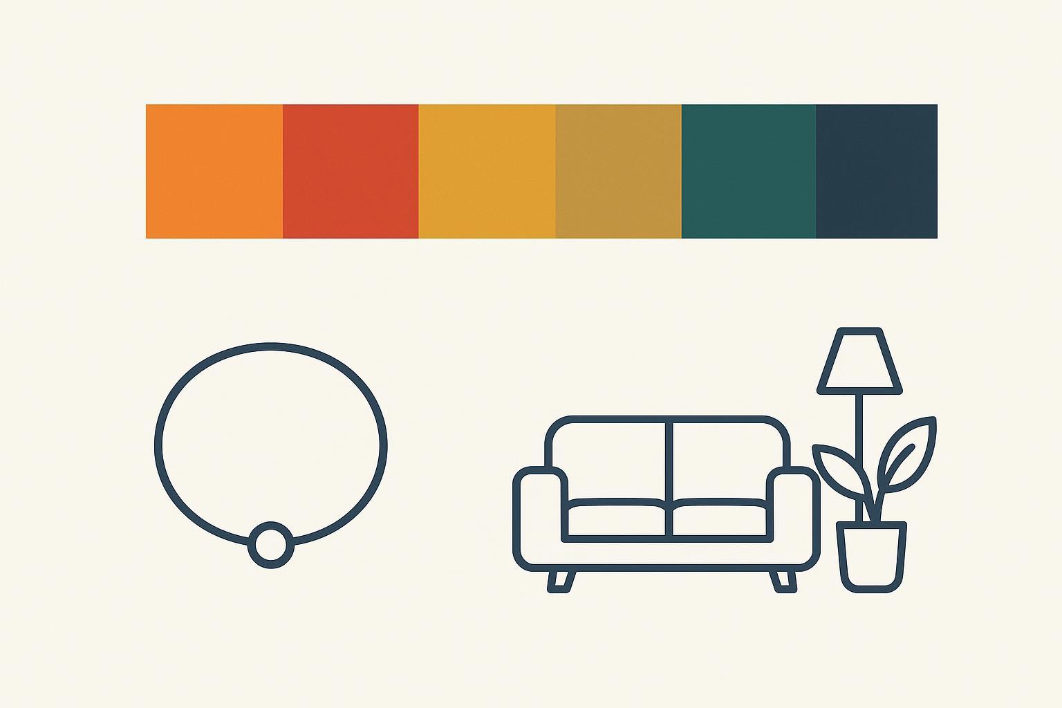
2026 Feng Shui colors palette at a glance
Five Elements snapshot
A simple way to think about Feng Shui colors is through the Five Elements—a balancing system that links color families to different qualities.
According to Anjie Cho’s guide to color and the Five Elements, the usual associations look like this: Wood (greens/teals), Fire (reds/oranges), Earth (yellows/browns), Metal (whites/grays/metallics), and Water (deep navy/black). If you’ve ever wished for a simple “Five Elements colors” cheat code, that mapping is the baseline.
Primary, supporting, balancing hues
For a Fire Horse year, most modern 2026 palettes keep Fire tones present—but not dominant everywhere. One design-forward list from Livingetc’s “6 lucky colors for 2026” highlights vivid Fire shades (like tangerine) alongside grounding Earth hues and clarifying Metal tones.
Here’s a practical way to hold the palette without overthinking it (yes, this works even if you’re just Googling “Feng Shui colors 2026” between meetings):
-
Primary (activate Fire): red, vermillion, tangerine
-
Supporting (build steady progress): mustard yellow, amber/ochre, warm earth neutrals
-
Balancing (keep it clean and calm): pearl white/off-white, metallic gold accents
-
Cooling (use sparingly if you feel overstimulated): deep navy/near-black accents
-
Growth note (especially helpful when life feels “stuck”): emerald/leaf greens via plants or small accessories
Wear vs display: how to choose
Use this quick decision rule:
-
Choose wearable color (bracelets) when you want support you can feel all day—especially for a single, personal goal.
-
Choose display color (décor) when you want to shift the mood of a specific space—without changing your whole lifestyle.
Bracelets: use color with intention
Pick one goal and one dominant hue
Bracelets are powerful because they’re close to your body—and because they’re small. That makes them perfect for 2026: you can work with bold color energy without turning your environment into a constant “on” switch.
Start by choosing one goal for the next 2–4 weeks:
-
Confidence + visibility: a Fire-forward red
-
Steady prosperity + follow-through: warm earth tones (mustard/amber)
-
Clarity + cleaner decisions: white/metallic accents
-
Calm focus: a touch of deep navy/black (not a full dark stack)
Then pick one dominant hue. If you want to stack, let everything else support it (more on that below).
Pro Tip: If you’re unsure, choose the goal you want to feel in your body (courage, steadiness, calm) rather than a goal you can’t control directly.
Materials that amplify color energy
Color is one layer; material is another.
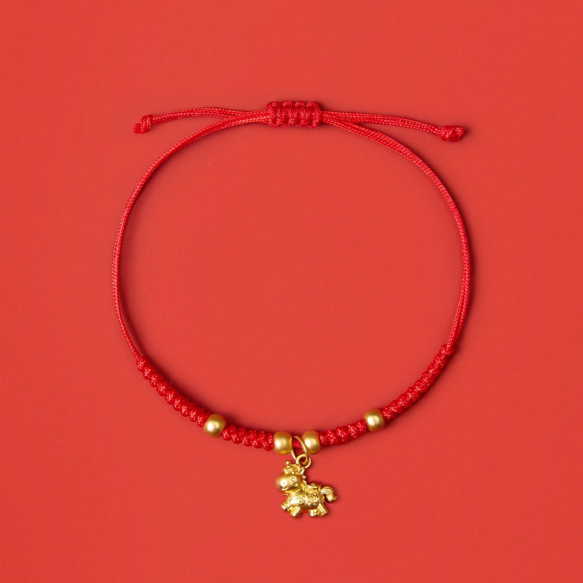
For example, a red string bracelet gives you Fire energy in the most everyday way—simple, wearable, and easy to keep subtle. If you want a real-world reference point, KarmaBless red string bracelets are a clear example of how that color can show up as a low-key daily reminder without becoming loud.

If your goal is to keep Fire energy from feeling too sharp, pair it with grounding or smoothing materials:
-
Jade with gold/brass accents: Jade is often associated with harmony and steadiness, while gold/brass reads as a warm Metal note—helpful when you want your confidence to feel centered, not edgy. KarmaBless’ Pixiu bracelet materials guide explains how people commonly match materials like jade and brass/gold to intentions.
-
Protective charm details (kept tasteful): A small charm can act like a “pause button”—something you touch when you want to reset your focus. The point isn’t to chase a miracle; it’s to give your mind and routine a steady anchor.
Smart stacking and daily wear rules
Stacking can be supportive—or it can become chaotic.
Use these simple rules:
-
One statement color, one support color, one neutral max. Example: red (statement) + ochre (support) + pearl white (neutral).
-
Keep the loudest color closest to your pulse. If red is your intention color, wear it as the piece you naturally notice.
-
If you feel wired, not empowered, reduce Fire first. Swap one red piece for a warmer neutral or a softer white.
-
Wear rules should be consistent. If you follow the “receiving hand” idea in Feng Shui traditions, many wearers choose the same wrist consistently for attraction-focused intentions.
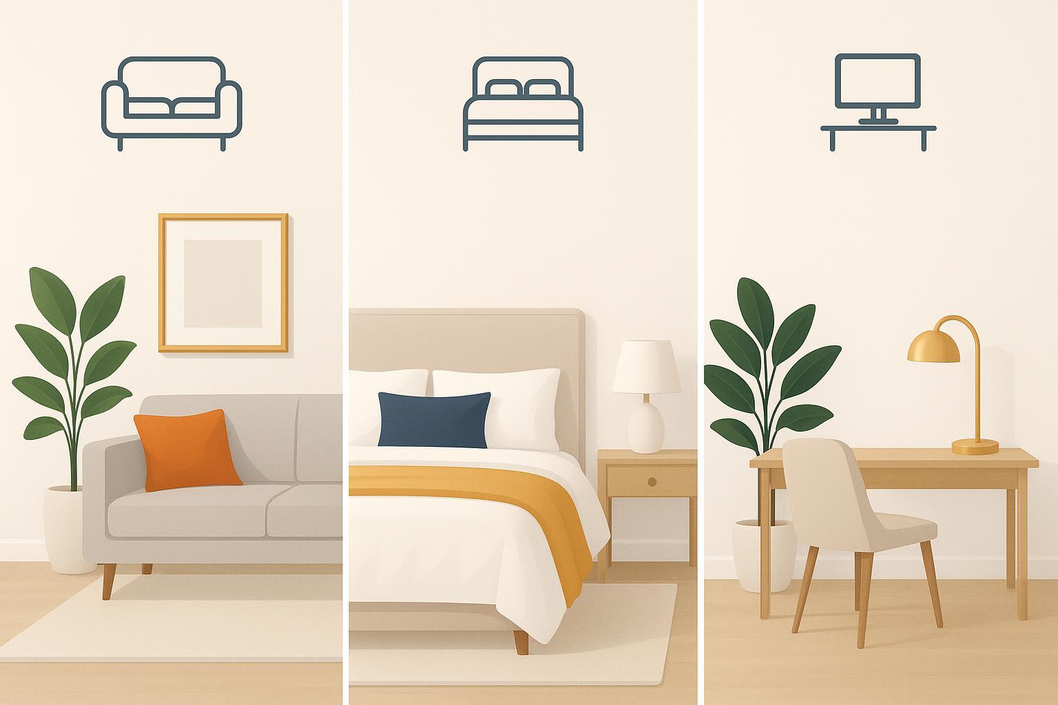
Décor: room-by-room moves
If you want to bring 2026 Feng Shui colors into your space without a full makeover, start with small, symbolic pieces you’ll actually use and see every day. For a curated set of lucky-color-friendly accents—especially protective home guardians and intention-based objects—browse KarmaBless’ Feng Shui home décor collection and pick one item per room.

Living room focus and prosperity
Your living room is where your home’s energy tends to “meet the world”—conversation, guests, movement, and daily momentum.
Try this 2026 approach:
-
Start neutral, then add one Fire accent. A tangerine pillow, a warm-toned candle holder, or a small piece of art is plenty.
-
Add one Metal note for clarity. A gold frame, a warm brass tray, or a mirror with a soft metallic edge can brighten without overstimulating.
-
Use Wood for easy balance. A healthy green plant is the simplest “growth” cue—and it keeps Fire from feeling dry.
If you like the idea of a “home guardian” or prosperity symbol in the main gathering space, choose a single statement piece from KarmaBless’ Feng Shui home décor collection and treat it as your one intentional anchor rather than adding multiple new items.
Bedroom calm and connection
Bedrooms tend to do best with less Fire.
Keep it gentle:
-
Pearl white/off-white base (bedding, curtains, or walls) helps the room feel breathable.
-
Earth warmth (ochre, sandy beige, warm wood) makes it cozy without turning it intense.
-
Tiny Water accents (deep navy/charcoal) can help the mind unwind—but keep it minimal so it doesn’t feel heavy.
If red feels meaningful to you, keep it symbolic and small: a single rose-toned object on a dresser, not a full red comforter.
Home office clarity and drive
A home office is where Fire can be useful—if you’re careful.
Try a “focused fire” setup:
-
One Fire accent for drive: a small red object (pen cup, notebook cover, desk art).
-
Metal for clean thinking: white space, a silver desk lamp, or a gold-toned accessory.
-
Wood for growth: a plant or a green accent that keeps ambition feeling healthy.
The goal is activation without agitation.
Mistakes to avoid (and quick fixes)
Overdoing Fire tones
What it looks like: too much red/orange everywhere—then you feel restless, impatient, or strangely tired.
Quick fix: remove Fire from the biggest surface first (a blanket, rug, large wall art). Keep one Fire accent, then add Earth (warm neutrals) or Metal (off-white) to stabilize.
Chasing only lucky colors
What it looks like: you collect “lucky colors 2026,” but nothing feels coherent—or you don’t actually use the items.
Quick fix: choose colors by function:
-
Wearables = personal intention and consistency
-
Décor = space mood and behavior cues
Pick one function first. Then pick one color.
Bringing Fire into calm zones
What it looks like: bright Fire colors in the bedroom or a meditation corner, and suddenly the space feels busy.
Quick fix: switch Fire for pearl white or soft earth tones in calm zones. If you want a hint of Fire, use it as a tiny symbolic object you can put away.
Seasonal and personal tweaks
Seasonal color shifts across 2026
Even if you keep the same “core palette,” you can adjust intensity by season:
-
Spring: bring in more Wood (greens/teals) to support growth and fresh starts.
-
Summer: use Fire as a highlight, not a backdrop—especially during busy weeks.
-
Late summer / transition weeks: lean Earth (ochre, warm beige) for steadiness.
-
Fall: add Metal (pearl whites, soft grays, gold accents) to simplify and refine.
-
Winter: use small Water accents (deep navy/charcoal) to quiet the nervous system—then warm it with Earth so it doesn’t feel cold.
Zodiac sensitivities and moderation
Your personal chart matters more than generic “lucky colors.” Two people can wear the same color and have totally different experiences—because what you need is often about balance.
If you want a simple, non-overwhelming way to personalize, start with KarmaBless free BaZi calculation chart to understand which elements you tend to have plenty of—and which you may want to bring in more gently.
Quick Bagua cues without overhaul
You don’t need a full Bagua remodel to work with placement.
Use “micro moves” instead:
-
Want more momentum? Add one Fire accent where you naturally look first when you enter the room.
-
Want steadiness? Add Earth where you tend to drop your keys, bag, or to-do list.
-
Want clarity? Add Metal near your desk or decision-making zone.
Keep it simple. If you can’t explain why an item is there, it’s probably just clutter.
Conclusion
Here’s your next step, kept intentionally small:
-
Choose one bracelet goal (confidence, steadiness, clarity, calm) and commit to one dominant hue.
-
Choose one room tweak and use one accent—not a whole new color scheme.
Balance is the point in a Fire-forward year. Pair Fire with steady counterweights: Earth to ground, Water to cool (sparingly), and Metal to clarify.
If you’d like a gentle personalization layer, check your element balance first, then choose one wearable and one room accent that support it. You can always add more later—once the first change actually feels good in your real life.